A/B testing (or split testing) can yield exponential ROI, and brings much-needed data to otherwise subjective debates over messaging and creative. Here are 40 A/B test ideas for SalesLoft or Outreach, emails, form pages, social, and paid advertising.
>> Related: Imagery Best Practices for Email, Social & Landing Pages <<
In this post:
Video walkthrough
Best practices to implement now
I’ve run a lot of tests across a lot of brands. I confidently recommend implementing these best practices now, especially while awaiting the results of other tests:
- Include teaser images – This is my top rec; I often see a 30% lift just by including teaser imagery of the content. Particularly images that are dense with data tables and data viz. Similarly, if you’re gating a video, you can include a dynamic clip or gif .
- Include analyst/3rd party logos on related offers – Another major boost to content offers. Layer on the third party validation and brand awareness.
- Add dark pull-quotes to landing pages – Readers are lazy and barely skim body copy. But I consistently see a boost by adding a short pull quote on a dark background.
- Don’t include a top nav on form pages – Always drive the eye to the main form and button. No distractions, no exits!
- Include a visible form on all landing pages – Don’t tuck forms behind a button. #readersarelazy
- Forms should be above the fold – Are you sensing a theme? #readersarelazy
- Use a special color for the button – Designers love to make things elegant and tonal. But this is a form page and buttons have to be bold.
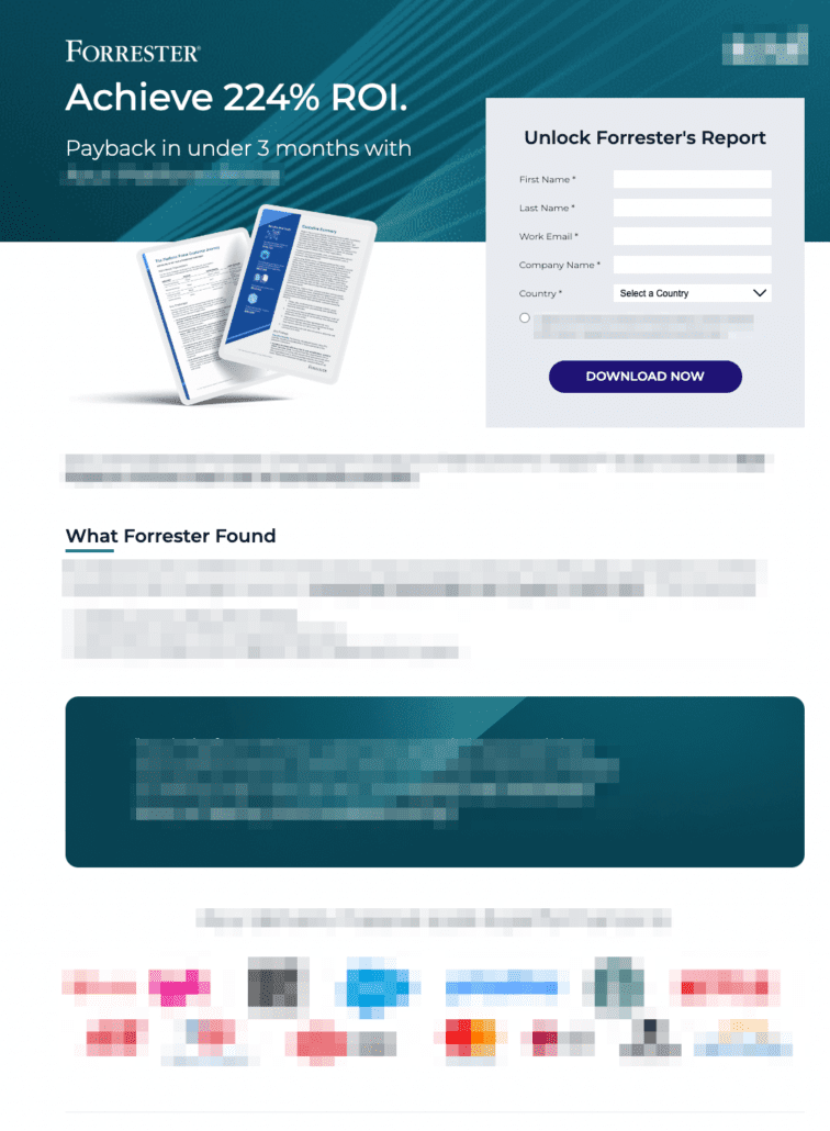
Here’s a sample client page that has been spiffed up to include all these recs:
How to approach A/B testing
A/B testing shouldn’t originate in random eureka moments. Some tests are really resource-intense, and don’t actually drive a lot of lift. Here’s how I structure and prioritize my hypotheses so split testing actually gets ROI:
Prioritize lower funnel tests first
Increasing MQL-SQL conversions rates by 5% gives a lot more bang for your buck than increasing PPC rates by 5%. Start optimizing in a reverse funnel… focus on LDR templates, then emails/pages, then display ads/social.
I usually brainstorm all hypotheses I want to test, then triage, then set them up in a sprint.
Prioritize fast/easy tests
A/B tests can take weeks to gather conclusive data. Prioritize testing within systems you already own, and ones that have built-in split testing. It’s so fast and easy to split test emails or Unbounce pages, whereas spinning up Google Optimize for the first time could eat weeks of work and still produce inconclusive results.
Don’t bother with small tests in creative/copy
Unless you’re market-testing a new tagline or competitive attack, I wouldn’t bother with A/B testing nuanced changes in headlines, body copy, or individual creative. Instead, look for larger trends.
Plan to institutionalize and implement results
I’ve saved the most important for last: A/B tests are useless until the findings are adopted. And adoption eats up a lot more resources than the tests themselves. So have a plan:
- How will you brief the team(s), freelancers, agencies, and designers on what you’ve discovered?
- Who will update global templates?
- Who will (gulp) comb through existing programs and hand-implement the changes?
One model I’ve seen and liked is using a quarter to run all the tests, and then the next quarter to implement the results.
Checklist: A/B test ideas
Finally! Here are the split tests I recommend trying:
A/B test ideas for Salesloft or Outreach
- embedded/hyperlinked imagery vs. text links
- embedded/hyperlinked “video” (i.e. a teaser image with a play icon on it)
- referencing the Last Interesting Moment in the first email’s subject line
This email looks like it contains a video, but it’s actually a hyperlinked image to the form page
A/B tests for landing pages
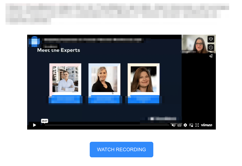
- placing webinar/event panelists above body copy
- email-only form vs. full form – Email-only will perform far better but make sure it doesn’t screw up your lead scoring or routing!
- different webinar naming conventions (i.e. “deep dive” vs. “webinar” vs. “interview” vs. “seminar”)
- button colors
- length of body copy, mix of bullets, etc.
- adding third party validation, including G2 scores, happy quotes, logo clouds, or Fomo
A/B tests for pop-ups
- pop-up background color
- pop-up button color
- pop-up timing
- pop-up trigger action
- call-to-action language (i.e. “learn more” vs. “read the research”) – People are noncommittal. “Learn more” often outperforms “download now”. 🤯
- linking to the landing page vs. embedding a small form in the pop-up
A/B tests for paid ads
- imagery…stock photo vs. illustrative treatment vs. text treatment vs. content teaser
- button color
- call-to-action language (i.e. “learn more” vs. “read the research”)
- flat vs. ombre/patterned background
A/B tests for email blasts
- plain text vs HTML template – Plain text often outperforms HTML!
- “from” Jenny Doe vs. Team Acme
- including Jenny Doe’s email signature
- naming conventions (i.e. “deep dive” vs. “webinar” vs. “interview” vs. “seminar”) – Does anyone want to watch a webinar? 🙅♀️
- title vs. sentence case in subject line – I tend to see short/casual sentence case perform better
- length of subject line
- personalization (i.e. “Hi {{first name}}”)
- time/day of send
- embedded/hyperlinked imagery vs. text links
- embedded/hyperlinked “video” (i.e. a teaser image with a play icon on it)
- call-to-action copy (i.e. “read more” vs. “read the blog”)
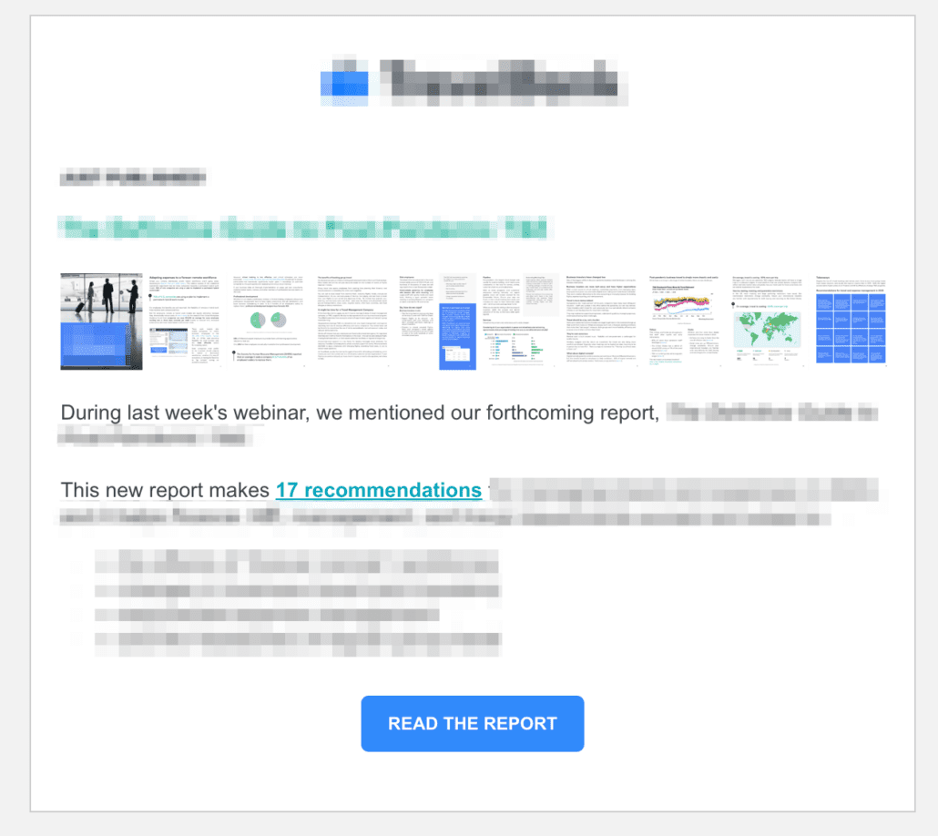
This email has a hyperlinked teaser image of the content.
A/B tests for email nurture
- referencing the Last Interesting Moment in the first email’s subject line
- plain text vs HTML template – Plain text often outperforms HTML!
- “from” Jenny Doe vs. Team Acme – True story, I once met a customer as a user event who was thrilled to meet the real person behind the emails!
- including Jenny Doe’s email signature
- personalization (i.e. “Hi {{first name}}”)
- embedded/hyperlinked imagery vs. text links
- embedded/hyperlinked “video” (i.e. a teaser image with a play icon on it)
- time/day of send
- call-to-action copy (i.e. “read more” vs. “read the blog”)
A/B tests for social
- stock imagery vs. illustrative vs. text treatment vs. teaser images – Candids perform especially well on LinkedIn
- day/time of publishing
- length of post – I see longer posts perform well on LinkedIn
FAQs
What is A/B testing?
A/B testing is a method of comparing two versions of a webpage, email campaign, app feature, or other digital assets to determine which one performs better. The objective of A/B testing is to identify changes that can improve a specific metric, such as click-through rate, conversion rate, or user engagement.
What is a dark pull quote?
A “dark pull quote” typically refers to a design element used in graphic and web design, especially in the context of editorial or content layout. The term “dark” in this context does not refer to color but rather to the design style. A dark pull quote is a variation of a pull quote that is designed to stand out from the rest of the content, drawing attention to a particular statement or excerpt within an article or document.
What is a last interesting moment in Marketo?
“Last Interesting Moment” refers to a feature that allows marketers to track and capture the most recent noteworthy engagement or activity of a lead within the Marketo platform.