There are a lot of ways to design B2B emails. Here are 5 B2B email layout options, and the content/offers they display best.
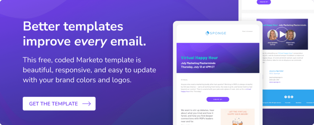
>> Related: You’re 3 Weeks Away from a Better Marketo Email Template <<
In this post:
First up, let’s define each component of an email
When designing templates, almost all imagery and copy will fold into the following categories:
- Headers
- Heroes
- Text body
- Image body
- Text & image body
- Call-to-Action (or CTA), usually in the form of buttons or bold hyperlinks
- Spacers
- Social links
- Footer
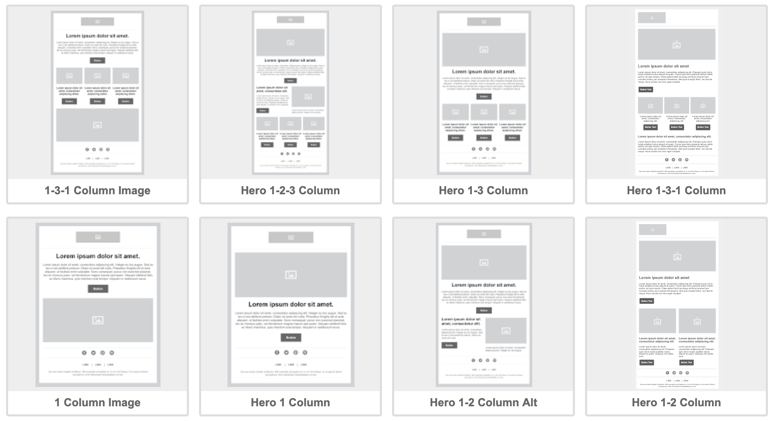
Here’s a “map” of each (thanks to Blocks Edit):

Click to expand
Single column email layout
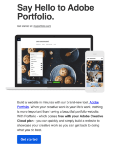
Single column emails are dirt simple, using a clear hierarchy with the most important information at the top. And they’re easy to optimize for mobile.
A single column layout works best for:
- Newsletters
- Welcome emails
- Promotional emails
- Transactional emails
Tip! Always add a CTA at the end, even if it’s just a “second chance” at your primary CTA.
Multiple-columns email layout
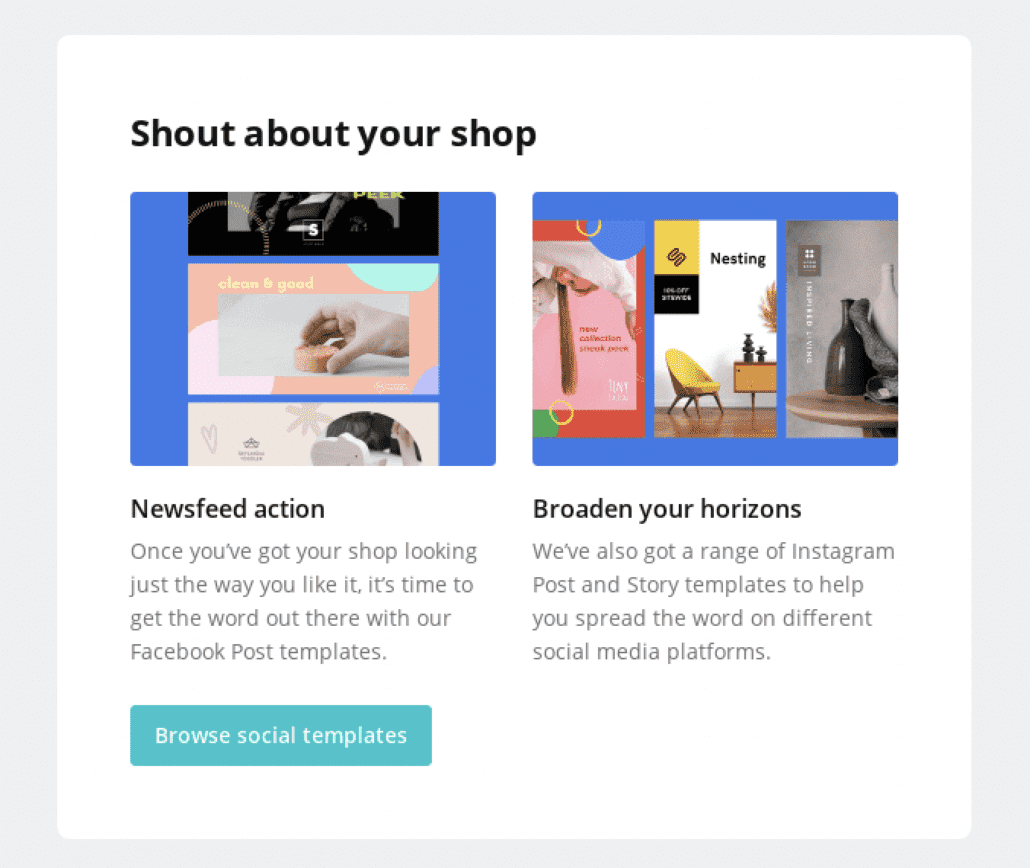
A multiple column layout works best for:
- Promotional emails
- Product announcement
- Weekly update emails
Tip! Complementary and streamlined imagery help prevent multi-column emails from appearing cluttered.
Inverted pyramid email layout
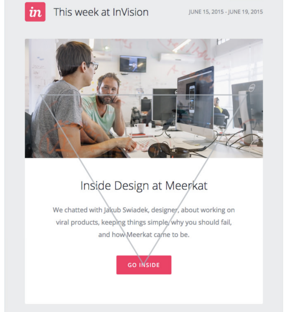
The inverted pyramid layout is designed to highlight the CTA button and eliminate any distractions.
An inverted pyramid layout works best for:
- Onboarding emails
- Promotional emails
- Welcome/activation emails
Tip! Even an email this simple needs to be UTMed and carefully QAed. Good design is never gonna fix bad process.
Zigzag email layout

The zigzag layout contains a ton of information and graphics but is still easy to read because it helps the eye flow through the email.
The zigzag layout works best for:
- Promotional Emails
- Product announcement emails
- Weekly update emails
Hybrid email layout

A hybrid layout is perfect for blending hierarchy and multiple CTAs. They usually contain a header at the top and secondary content in multiple columns underneath.
Tip: Never forget to A/B test your layouts. Sometimes plain text emails simply outperform the most beautiful designs. Or multiple offers end up confusing/distracting readers and convert fewer leads than a singular CTA. The best B2B email layout is whichever one best suits your database.
Header image via SalesforceBen.com